
Andytown Coffee Roasters Rebrand
Andytown Coffee Roasters is a local coffee shop in San Francisco, California. The aim of this rebrand was to design a new brand identity that will encourage new clientele and aid in capturing their statement of approachability and sustainability within the coffee industry.
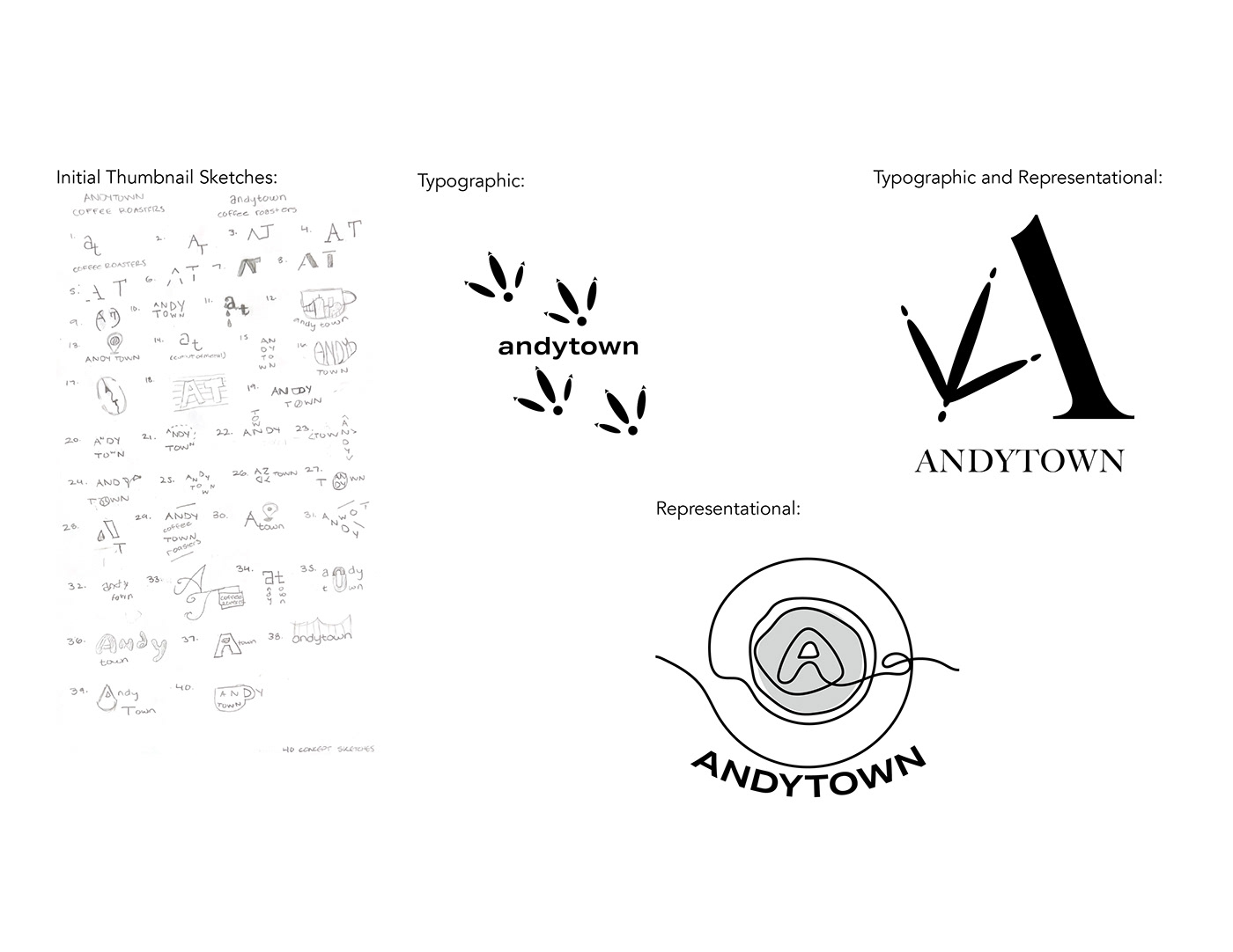
When beginning the ideation of this rebrand, I wanted to ensure that Andytown's graphic identity helped in reflecting their products whilst staying true to their business motivations. Sustainability and approachability stood out to me the most which aided in the creation of some city-based logo thumbnail sketches as well as focuses on plant and coffee bean imagery. Though solid branding is held throughout Andytown's business, their logo mark fails to gain public interest as there is no specificity of what they sell. Therefore, when sketching up some concepts I wanted to make sure that there was clarity in what they may sell to give the viewer more insight on Andytown's business.

Reversed White On Black and Final Black and White Design

Final Color Decision and Color Process Iterations
The final design of the Andytown rebrand is an efficient and fresh approach to a graphic identity due to its alluring appearance through bold forms, cohesive branding, and a illusionistic logo mark that gets the consumer to really think. The logo mark accomplishes the aforementioned goals that the rebrand was attempting to deliver: approachability, transparency, and sustainability within the coffee industry. The logo mark depicts an abstraction of their famous drink: the Snowy Plover whilst also accomplishing an abstraction of the letter ‘A’ that is found in the company name. The use of a single earthy hue with different shades throughout the logo mark offers a pleasing visual experience that attracts a large range of consumers whilst also aiding in the mission of sustainability. The typographic choices were made to unify the business brand with the logo mark for cohesiveness and the goal to present friendliness.

Final Logo Mark with Color Application
The process of rebranding a business that already has strong branding helped to broaden my outlook as a designer. It encouraged me to think in an abstract way as to avoid falling into the trap of using the typical imagery seen in many other brands; for example coffee mugs, coffee beans, and pastries. As a designer, I am now able to comprehend the importance of displaying a logo mark at different sizes, in different colors, and on different materials. In my new view, the consumer experience is extremely important to a business therein placing a major responsibility on a designer to create a brand identity that is memorable and lasting.
Rebrand Applications


